Wednesday, October 17, 2012
Web Design and Typography
Typography is a big part of web design. From the Title, to the headings, to the navigation, you can't make a functional site without type. Thus, good typography is essential for designing a good website. It can establish the tone of your website, whether you want it to feel professional or playful. It can make your site more aesthetically pleasing. And it can establish hierarchy and legibility in your site, making it easier for users navigate through it. Here are some great examples of typography in websites, from the article, "21 Examples of Inspiring Typography in Web Design," :
Saturday, October 13, 2012
Trends in Web Design
Here are some of the recent trends in web design, from this article, Web Design Trends in 2012 :
- Responsive Web Design: Not surprising with all mobile web devices we have these days.
- Fixed-Position Navigation: Helpful to users, if you don't have a large navigation.
- Circles: Thanks to CSS3 these are easy to make, and visually appealing on your site.
- Big Vector Art: Cute vector mascots have become a popular marketing tool for companies such as Mozllia Firefox and MailChimp.
- Multi-Column Menus: Great and easy to use, if you have lots of navigation links.
- jQuery/CSS3/HTML5 Animation: Entertaining and compatible animations.
- Ribbon & Banner Graphics: A visual technique rising popularity due to the ease with which they can be made these days.
- Custom Font Faces: Thanks to providers such as Typekit and Google Web Fonts, custom fonts are easier than ever to include in your site.
- Infographics: Popular due to how easily they provide users with information.
- Simplicity: Minimalist design, easy to use, lets users get to what they want and fast.
Wednesday, October 10, 2012
Some Inspiration
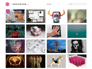 I found this great website full of inspiring designs, called The Inspiration Grid. It has all kinds of artworks, from digital art, to photography, to web design, to graphic design. It appeals to any and all kinds of artists. The works on the site are very innovative and interesting . As the site says, its a great place to look for inspiration.
  The site is designed quite well. It's very clean and
straightforward. Most of the space is dedicated to a grid gallery of the
works. If you want to see more of any of the works you can click on the art and more images will drop down below it. This works well since the purpose of the site is to look at the
art. I like how this lets users see what they want without having to go
through various navigation, webpages, etc. I also like how it allows you to look at a lot of works at once without having to go to another webpage. If navigation is wanted, you
can find it at the top and look through various categories of arts.
Thursday, October 4, 2012
Web Design:Things to Avoid
I read this article about mistakes to avoid when designing a website: "10 Things NOT to do When Designing a Website". It share these tips:
- Don't clutter your site with tons of adds, images, text, etc. Keep it simple and easy to look at.
- Don't use flash intros. They take too much time to load and play. People will get board and move on.
- Don't use uncommon navigation. Make it easy for people to find and use your navigation.
- Don't include unnecessary gadgets (widgets, counters, etc) Only include them if the user absolutely needs them. Otherwise they take up space and time.
- Don't include music without controls. Allow people to turn off the music if they want to.
- Don't use images instead of text. This will make your website hard to search.
- Don't use crappy photos. Bad photos make it look like you don't care about your site.
- Don't use really large images. This increases loading time of the page. People will get board and move on.
- Don't use tables for layouts. This makes updating the site more difficult.
- Don't use too many colors. It can be hard on the eyes and ugly. Keep to a simple color scheme.
Awesome Infographics
Since I'm currently working on an infographic project for another class, I'd thought I'd share this infographic blog, Cool Infographics. This blog has got some great stuff. It has infographics on just about any subject, from twitter usage to Olympic sport stats. There's so much variety in the works shown on the site. I've picked a few of my favorites to show here.
The first one, the one about Trivia has a fun illustration style and playful layout, reminiscent of a board game winding your eye through the various parts of information. The Planet one great too. I love how it feels so different from most infographics. It's just a circle filled with little circles, yet it makes perfect sense for the subject. The color one has a nice geometry to it. It has a clean layout with a modern feel. The Cooking graphic is great because it is so simple. It distills the information into a single diagram that is easy to understand and aesthetically pleasing.
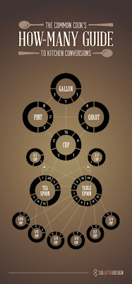

The first one, the one about Trivia has a fun illustration style and playful layout, reminiscent of a board game winding your eye through the various parts of information. The Planet one great too. I love how it feels so different from most infographics. It's just a circle filled with little circles, yet it makes perfect sense for the subject. The color one has a nice geometry to it. It has a clean layout with a modern feel. The Cooking graphic is great because it is so simple. It distills the information into a single diagram that is easy to understand and aesthetically pleasing.


CSS Tips
Heres' a great article sharing some useful tips about using CSS, " 20 Useful CSS Tips for Beginners." Since I'm a beginner, I found them very helpful. It shares some basic tips like knowing the difference between a class and id, using divs instead of tables, etc. It shares ways to keep you CSS style sheet from getting too cluttered and confusing, such as using shorthand CSS:
Instead of doing this:
background-color: #FFF;
background-image: url (image.gif);
backround-repeat: no-repeat;
Do this:
background: #FFF url (image.gif) no-repeat;
The article also mentions some new things that I hadn't heard before. I learned that you can use the code, !important, to make sure something follows that particular style, even if there is another style that would usually override it. It also shares the codding to replace text with images, commonly used in headings, and some free CSS Editing Applications:
Simple CSS
Notepad++
A Style CSS Editor
Retro Design Blog
I found this great graphic design blog, called Grain Edit (http://grainedit.com). It's full of all sorts of retro designs, like 1950's-1970 and modern designs inspired from that era. I love the style of these works. I like how the illustrations are draw with simple geometric shapes. It give the works a very clean feel. Yet, the shapes are combined to make very playful images. I also love the bright color schemes with the rich pinks, reds and blues. These designs simultaneously have a fresh and classic feel.
Subscribe to:
Posts (Atom)


